Mission 10 · Completed · Mobile and web design
BurnathonCollective Fitness
A fitness product that turns individual exercise into a shared total: log what you did, and watch your calories join a community counter racing a countdown clock.
Project snapshot
- Role
- Designer
- Project type
- Mobile and web application · fitness and activity tracking
- Team
- Client engagement
- Status
- Design delivered across mobile and web
Tools & methods
- Product positioning
- Interaction design
- Visual identity
- Mobile and desktop UI design
Context
Most fitness apps are built around one person and their own numbers. Burnathon, designed under the FoodSport brand, starts from a different premise: your calories are a contribution. Everything you burn is added to a collective total that the whole community is pushing upward against a countdown clock.
That single decision changes the product. A personal tracker competes with every other personal tracker on precision and feature depth. A collective challenge competes on whether people feel part of something — which is a design problem rather than a data problem.
Design problem
Effort disappears once it is done
A workout logged into a private history has nowhere to go. The product needed somewhere for that effort to land where it would still matter tomorrow.
Solo motivation runs out
Personal goals work until they do not. A shared target with a deadline supplies a reason to log today's session that a personal streak cannot.
Logging has to be almost free
Anything that takes more than a few taps after exercise will not get done. The entry flow had to be shorter than the temptation to skip it.
The category looks clinical
Fitness interfaces trend calm, medical and neutral. This product needed to feel like exertion, not like a health record.
My role
Designer. The work covered product positioning, the interaction model, the visual identity and the interface across both mobile and web.
The aesthetic direction came from the client, who wanted something with energy rather than something clinical. Resolving that against the usability goal — that anyone should be able to work out how to use the app without instruction — was the central design tension of the project.
Design decisions
The collective number leads
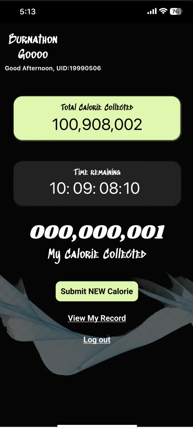
The community total is the largest element on the home screen, above the user's own figure. The hierarchy states the proposition before any copy has to explain it.
A countdown, not an open goal
A running clock sits directly beneath the total. A shared target with no deadline is an aspiration; a shared target with a deadline is an event.
Simplicity as the first constraint
The simplest and most intuitive structure the product could carry, so a new user learns it in one session with nothing to read first.
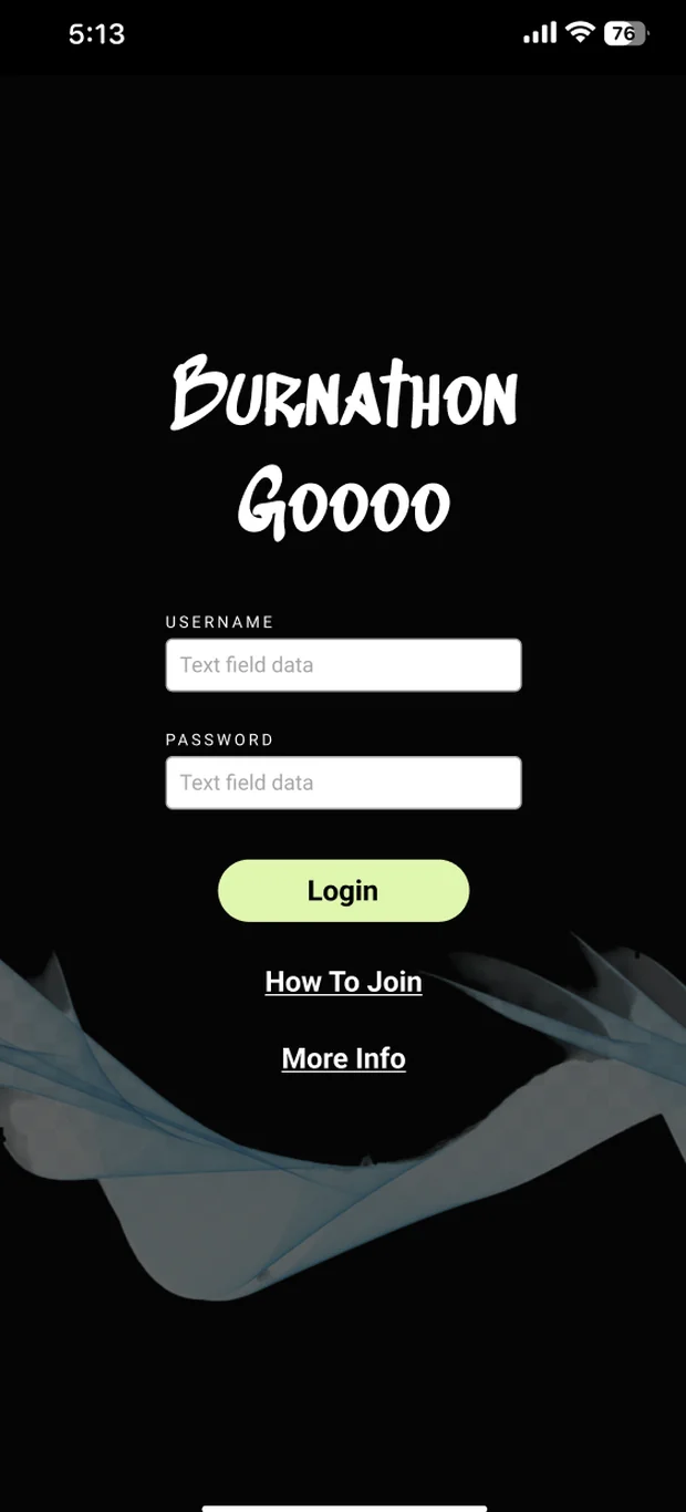
Lime on black
A sharp, high-contrast palette that carries the sensation of burning calories into the identity itself — unusual in a category that defaults to calm blues and whites.
Logging in structured steps
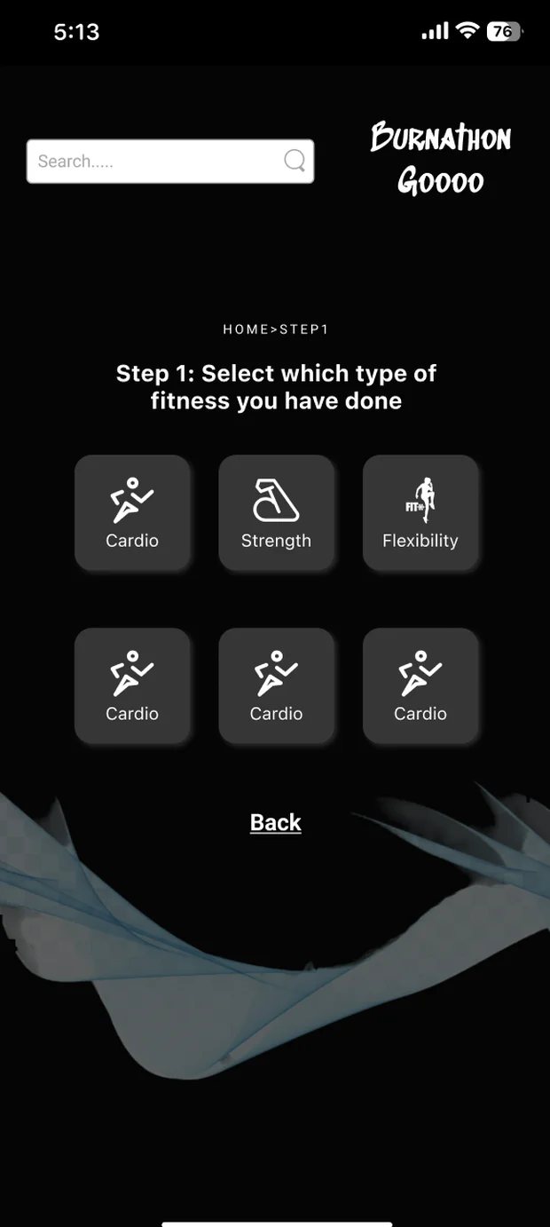
Activity entry breaks into labelled steps beginning with the type of exercise, so each screen asks one question and the whole flow stays skimmable.
Journey tracking
A personal record view alongside the collective total, so people can see their own accumulation building underneath the shared one.
The mobile product
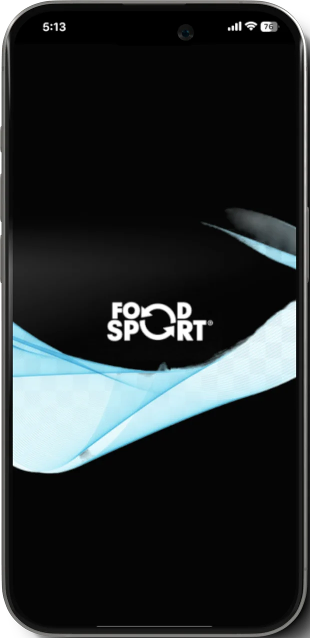
Four screens: the branded entry point, sign-in, the collective dashboard, and the first step of logging an activity.
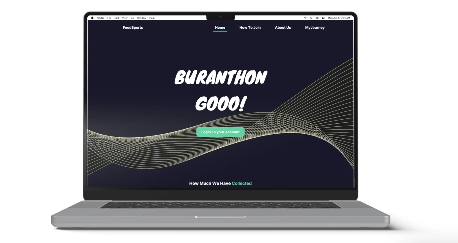
The web product
The same identity carried onto desktop, where the collective total becomes the headline rather than a panel.
Solution
A two-surface product with one identity. Mobile is where activity gets logged and the collective total gets checked — short sessions, large numbers, minimal chrome. Web is where the challenge is explained and joined, with room for the how-to-join and about material that would clutter a phone screen.
The visual system does real work in both. The brush-script headline, the ribbon motif and the lime-on-black palette carry effort and momentum, which means the interface reinforces the product's proposition rather than staying neutral while the copy does the persuading.
Reflection
The tension worth remembering is that a client asking for a strong aesthetic and a design goal demanding effortless comprehension are not automatically compatible. Resolving them into one sharp colour system that also reinforced the product's core action is the decision I would carry into another project.
Placed alongside the later work in this portfolio, it also marks a starting point. The instinct visible here — find the one thing that differentiates, then design the whole product around it — is the same instinct applied at much larger scale in the enterprise and AI work that followed.